All About the Psychology of Colour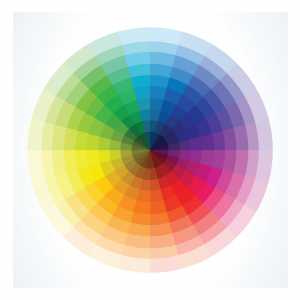

The psychology of colour can be used by businesses to influence consumer behaviour and encourage different reactions.
Colour plays an important role in influencing what consumer’s think. Do you feel calmer when surrounded by cool colours like light green and sky blue? Do neon or bright colours trigger excitement? Does the colour red make you feel slightly alarmed and panicked? Or does it trigger a sense of urgency?
We’ll be exploring how the psychology of colour plays a crucial part in marketing and how businesses can use different colours and tones to influence our decision making.
What is the Psychology of Colour?
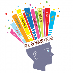
It’s an area of research that looks at how different colours trigger different responses, emotions and decision-making.
When used in marketing, colour can trigger emotions and influence purchasing decisions for consumers. The psychology of colour is another marketing tactic that businesses can use to better their campaigns, their web design, mailers and so on.
Isn’t Colour Subjective?
It is.
Colour can often come down to personal preference, culture, experience and view point. The idea that a specific colour absolutely triggers one specific action (like yellow evoking happiness) is false. While it may be true for some consumers, colours are not perceived the same by everybody.
But, there’s still plenty about the psychology of colour to learn and how marketers can use different colours in their branding and future actions.
 How Consumers Typically React to Different Colours

Yellow
Is yellow unsightly and too bright or does it encourage strong positive emotions that converts into happiness?
Yellow is typically a ‘happy colour’ but different shades can change the way consumers view it. For example, a bright, bold yellow may cause irrationality.
Orange
Orange, a classic autumn colour, tends to be considered a warm, light colour.
It’s typically the colour of courage and confidence, but a darker orange can be associated with frustration.
Red
The colour red can go either of two ways. For some, it may trigger anger and danger, but for others it prompts excitement and passion.
Using the colour red on buttons, for example, may create a sense of urgency which can be very effective in getting consumers to click on a link.
Or, for some it could be perceived as a warning.
Green
Most commonly associated with nature, green is commonly a tranquil, relaxing colour that signals growth and health.
Ever heard the phrase ‘green with envy’? Could the colour green be spiteful?
Blue
For some blue is a calming and trust-worthy colour, but for some it’s the symbol of loneliness and coldness.
Both Facebook and Twitter use blue in their logo and branding, so blue must be doing something right?
Purple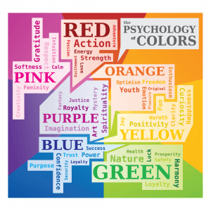
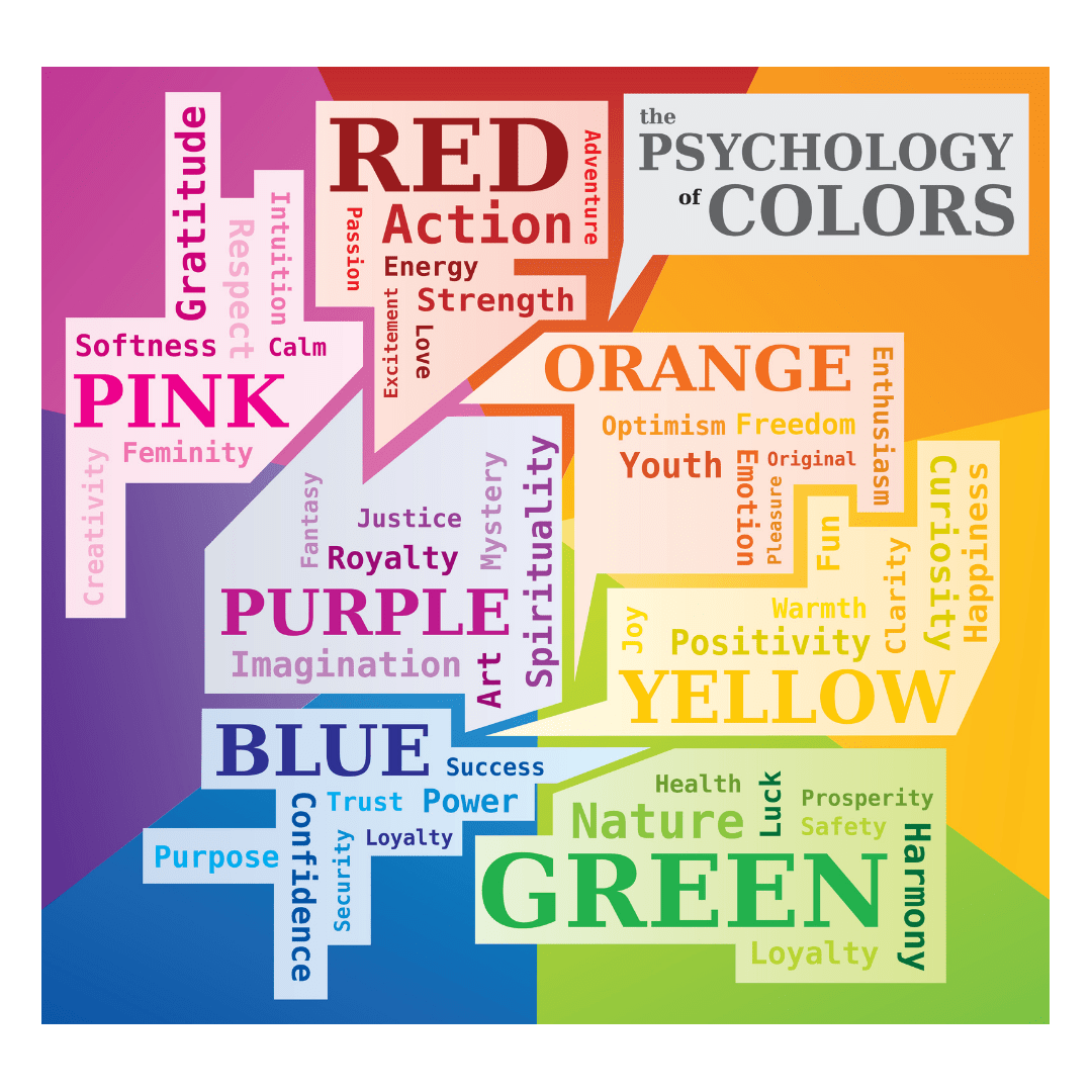
Does purple symbol wealth to you? Or suppression?
Perhaps if you want your brand to be seen as prestigious, purple is the ideal branding colour.
Pink
Pink is mostly commonly used to portray stereotypical femininity (think of barbie), but it’s also a fun, playful colour.
But is it gender exclusive? Could you reach your male audience if your branding was pink?
Black
Authority or mourning?
Black is a pretty powerful colour, its bold and often utilised by fashion brands to make a real statement.
But is black boring? With so many other capturing colours to choose from, is black the best?
As weird as it may seem, choosing certain colours to reflect different feelings can be an important asset in making sure your brand makes the biggest impact.
What colours do you use? Why? Let us know in the comments.