Beginner’s Guide to A/B Testing for Websites
In this article, we will be detailing how you can implement A/B testing for websites to increase conversion rates, generate leads, increase sales and boost ROI.
Websites demand a lot of time and money, so you really should be making the most of it! From completing sign-up forms to booking an appointment to discuss your services, its important businesses know how to get the most out of their website. And one way to do it is through A/B testing.
A/B testing for website helps to not only optimise it, but also tell businesses exactly what’s working and what isn’t.
If you’re completely new to A/B testing, get up-to-speed with our previous blog post “Beginner’s Guide to A/B Testing”
How Does A/B Testing for Websites Work?
It’s the comparison of two variations of a webpage, the variation can be anything from a completely different page format or an alternation in wording on a CTA button. To get the most accurate results, you should only change one item at a time.
It’s a technique for increasing your website’s conversion rate. If you had two different headlines for your Contact page, for example, you could run an A/B test to see which one would deliver the best results.
Page A would have one headline and page B the other. 50% of your website traffic would be directed to page A and the other 50% to page B. At the end of the test, the winner is the page that generated the most conversions.
What You Could Test
You can test anything you want, but if you’re a beginner, there are 4 main features you may want to start with.
1. Content Length
Should have you have lengthy copy? Or short snappy sentences?
Do your audience want to read about your product in detail before they can buy it? Or will bullet points do?
2. Headlines
Your headlines are usually the first thing consumers read, so it’s important it really grasps their attention. What style of headline will have the most impact? An instructive tone or one that builds excitement?
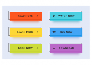
3. CTA Buttons
The colour, size, placement and the language used within your CTA can really make a difference to whether consumers click on it or not.
4. Images
Test what images work and ones that don’t trigger a reaction from your audience. Maybe larger banner images at the top of your pages grab attention or smaller images featured within the content do the trick.
Conclusion
Begin by identifying the exact page you want to be focusing on and work from there. Use data from software like Google Analytics and look at your website traffic and conversion data. Consider what pages consumers are visiting most and where they’re converting to see what element needs to improve to boost your conversion rates.
Do you have any A/B testing for websites success stories? Let us know in the comments section below.