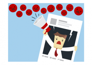
 Why People Are Leaving Your Website?
In today’s article, we will be looking at the top reasons why people are leaving your website without converting. If you’re having issues getting website visitors to convert, then pay attention to the following mistakes which typically cause people to exit your site.
Your content is compelling. Your product images are high-quality. Your site is professional and well designed. And your marketing efforts are bringing targeted traffic to your website.
But why are so few visitors converting?
Why are you not generating leads?
Why are you not converting leads into customers?
The above are typical issues for businesses. Unfortunately, building leads and converting them into paying customers isn’t just a hop, step and a jump.
There are many possible reasons why people are leaving your website, some which can be easily fixed. Take a look at the top reasons.
1. Your Website’s Too Slow
If you’re pages are loading at a snail’s pace – then consumers won’t bother waiting around.
Slow and steady doesn’t win the race for websites – they need to load fast to keep the visitor’s attention.
Unsure why your website is running slow? – Why is My Website Slow?
Looking to speed up your website? – 4 Tips to Speed up Your Website
2. Your Web Design Isn’t Doing You Justice
Your site design can have a pretty big impact on how much a consumer trusts you.
In fact, a study found that 94% of people distrust a website due to design problems.
So, if your site has ….
- – Clever, weird site names
- – Busy layouts
- – Navigational problems
- – Boring web design
- – Un-strategical pop-up ads
- – Small font
- – An overload of text
- – Poor search functions
… then you’re waving the red flag for visitors not to trust you. Perhaps it’s time for a revamp.
3. Your Content isn’t Quite as Compelling as You Thought
The font, colour and the actual copy within your website can all impact how well visitors can read and digest the content on your website.
If a consumer can’t easily ready your content, then chances are they’ll give up trying and look for a similar website.
There’re no concrete rules about the font, colour and copy you use … but try to keep it clean, clear and easy to read. If you’re copy is too small, for example, then some consumers won’t be able to read it. If the copy doesn’t stand out from the background, then visitors might face difficulty reading it.
4. You’re too Pushy?
How many pop-ups do you have on your website? For some consumers, one pop-up too many and they exit your site for good. We’ve debated the need for pop-ups before, read about – Should Websites Feature Pop-ups?
Could too many ads on your website be the reason people are leaving your website? If your site depends on ads, then eliminating them completely from your website won’t be an option. But you don’t need to have them absolutely everywhere.
For website visitors to convert, they need to trust you. if they don’t trust the ads you’re displaying because there’s too many of them, then they’ll exit.
Can visitors see your content? Or are they bombarded with ads the second they land on a web page? Think about the visitor, are you giving them best user experience if they have to wade through countless ads to look around your site properly? Probably not.
5. Your Sign-up Forms Are Too Long
There’s a fine line between gathering the data that you need about the consumer and being completely invasive.
With every field you add, for example their gender, ages or interests, ask yourselves if it’s imperative you have the information.
6. Your Navigation is Confusing
What if visitors have come to your website looking for an exact piece of information, like a product or address? What if they can’t find it?
If you’re navigation is unclear, visitors will get frustrated and leave.
Think like you’re a first-time visitor. How would they expect to find your website designed? How do you think they’d expect to find specific information?
7. Have You Forgotten Your CTA?
Calls-to-action, CTA, are necessary for every website.
Whether your CTA is to enquire now, buy now or sign-up, it has to be clear, noticeable and encouraging.
8. Do You Have a Responsive Design?
You’re design needs to be responsive for all screen sizes, desktop, laptop, iPad, phone etc.
Nearly 8/10 customers stop engaging with content when it doesn’t display well on their device. A website that you have to pinch and zoom constantly just isn’t good enough in 2018 – consumers need responsive websites.
Did you know Google prioritises responsive websites? So, you could be missing out on traffic too.
What to Do Next
Take a look at your own website. Identify and fix possible issues which could be significantly impacting your website’s conversion rate.
In some cases, businesses struggle to recognise issues with their site because they’re blinded by bias. Other times, it’s because they simply don’t know what’s wrong.
But we could help.
Contact us for a free, no obligation consultation and discover what we could do for your website.
E: contact@differentgravydigital.co.uk
Tel: 0161 706 0004
Why not check out our Digital Marketing Terms Glossary?
About the author:
Marie Harwood is a Digital Marketing Assistant at Different Gravy Digital, Hale, Cheshire.
Different Gravy Digital are a full service Digital Marketing Agency operating in the Hospitality & Leisure, Financial Services, Legal & Property sectors. Products and services range from; 3D & 360° Tours, Website Design & Build, Social Media, Video Production, Search Engine Optimisation (SEO), Content Creation, Email Marketing, Online Feedback / Review Systems and Paid Advertising (Google, Bing and Social Media).
Contact Details:
marie@differentgravydigital.co.uk
0161 706 000
120a Ashley Road, Hale, Altrincham, Cheshire, WA14 2UN