Are Website Pop-ups Effective?
Do website pop-ups help conversion rate optimisation? Or are they just annoying? In this article, we discuss the power of pop-ups and how to implement them.
What Are Website Pop-ups?
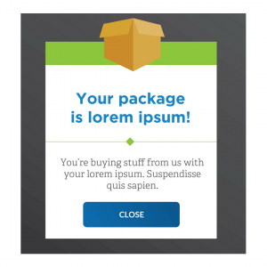
A website pop-up literally ‘pops-up’ on a web page. They can appear at any time, when a user first clicks on a page, after a few minutes of being on a page or when a user clicks to leave a page. Typically, website pop-ups are …
- – Advertisements
- – A method to boost conversions, like a signup form
- – Incentives to stay on a page
- – A chance to enter a competition or receive a discount code
- – Links to another part of the website
Are Pop-ups Dead?
According to Sumo, pop-ups are anything but dead. Here’s what they found …
- The first pop-up performs 30% better
- The average conversion rate for all pop-ups is 3.09%, but if you had 100,000 visitors, that’s 3,000 subscribers
- Pop-ups with more context have higher conversion rates
- Only 3/100 people every have pop-ups with conversion rates over 11%
Whilst pop-ups might be annoying to some website visitors, they seem to work …
- Implementing a pop-up strategy boosts email list opt-in
- Pop-ups have a 2% better click-through-rate, CTR, then other kind of ads
Pop-ups Might be Ineffective When …
- There are too many in a short space of time
- They serve no purpose
- They’re irrelevant to the visitor
- They slow down the speed of the website
How to Use Website Pop-ups Correctly
Personally, I think pop-ups are a great conversion tool. But, only when they’re well thought out, designed efficiently and don’t clutter up a website.
They Shouldn’t Get in the Way of Website Visitors
- Pop-ups shouldn’t be an obstacle for visitors.
- Make them easy to read, not too much content
- They need to be clearly skippable
- If you’re prompting an action, make it easy to fulfil (for example, a short signup form)
- They shouldn’t be so big they hide the entire page behind them
 Use Them for the Right Occasions
Less is more … visitors shouldn’t be faced with pop-ups left, right and centre! You don’t need a pop-up on every page, because if a user has already exited your previous pop-up they probably won’t want to see it again.
In my experience, if a website features too many pop-ups, I get irritated and visit a different site. If they’re taking up too much of my time and are becoming a nuisance, I simply go back to the search engine results page and try another link.
I think too many pop-ups ruin the website experience, it comes across like the business is ‘trying to hard’ and isn’t getting my attention in the right way. Having said that, when pop-ups are used sparingly, they work brilliantly.
Pick Your Timing
Consider when your pop-up is likely to have the most impact. For example, if your pop-up has the purpose to increase sign-ups to your newsletter, then scheduling the pop-up to appear straight away once they visit your website isn’t the best idea. Wait a short while, let them get a feel of your website and after they’ve started to view your content themselves before you push them to sign-up.
Conclusion
So, if you resistant to run pop-ups on your website, then it’s time to review your decision. Admittedly pop-ups do have a bit of a bad reputation, but that’s only the case when they’re used incorrectly.
If you consider your audience carefully and place your pop-ups where they’ll be valued, then you should not face any problems.
Why not check out our Digital Marketing Terms Glossary?
About the author:
Marie Harwood is a Digital Marketing Assistant at Different Gravy Digital, Hale, Cheshire.
Different Gravy Digital are a full service Digital Marketing Agency operating in the Hospitality & Leisure, Financial Services, Legal & Property sectors. Products and services range from; 3D & 360° Tours, Website Design & Build, Social Media, Video Production, Search Engine Optimisation (SEO), Content Creation, Email Marketing, Online Feedback / Review Systems and Paid Advertising (Google, Bing and Social Media).
Contact Details:
marie@differentgravydigital.co.uk
0161 706 0004
120a Ashley Road, Hale, Altrincham, Cheshire, WA14 2UN