Does your company have a responsive website? The days when websites where only viewed on desktop screens are long gone. A lot of us now view websites on our mobiles rather than a desktop, resulting in desktop responsiveness not being the only concern when developing a website! In fact, smartphones and tablets dominate 48.7% of web browsing traffic. The popularity of mobiles has also affected the way developers design websites, encouraging for tidy, simple layouts.

Responsive design means when a website will adapt accordingly to the screen it is being viewed on, regardless of the device used to access the website. If a website was accessed by a mobile phone, it should automatically reformat to suit the screen, so users should still have the best experience. Just think about the variety of mobile phone screen sizes. iPhones, have different an array of difference screen sizes even for their latest models. Whilst mobiles are the most popular device for viewing websites, we must also consider the responsiveness for tablets, iPads and bigger screens.
Responsive websites are still relatively new, there’s still a lot to be learnt and mobile-friendly websites can sometimes be difficult for businesses to understand, design and develop. It can be difficult to even know where to begin, but our quick tips will help you to get started.
From 2015, Google changed their search engine algorithms, so a mobile responsive website is crucial if you want a high ranking when people make a search relevant to your website. The new-ish algorithm alone justifies why responsive websites are vital to any business, as without it you won’t have as much traffic to your website or publicity. If you want an in-depth description of the algorithms from Google themselves, check out how they work here.
Now we understand what a responsive website is, here’s our quick tips to help you get there!
Tip 1
 Whilst your font and button size do matter for desktop viewing, it matters a lot more for mobile devices and smaller screens. Your font size should be bigger, big enough for everybody to see on a small screen. You must consider people’s eyesight, if users keep having to zoom in and out and scrolling right and left to read your content, it’s likely they’ll get annoyed and use a rival’s website!
Tip 2
The bigger the better for button sizes, they need to be visible and users need to be able to click them without missing! We’ve all been there, furiously stabbing at the screen and continuously missing the button because it’s far too small for our fingers. Just like with inappropriate font sizes, users may give up trying and use a rival’s website instead. Google says 61% of users are unlikely to return to a mobile site they had trouble accessing and 40% visit a competitor’s site instead.
Tip 3
Keep it snappy. Only include content that’s needed. You need to work within the confinements of small screens, that means using simple, clear sentences and bullet points for easy reading. 91% of mobile users say that access to content is very important, so your site must have accessible content.
Tip 4
Make sure the most relevant information is at the top of your website, whilst mobile viewing is the most convenient way to access a website, not everybody finds reading from a small screen easy. Often people just look for the key information, so make sure they can see it. If your business has a location and you’d like customers to come and visit, provide a link to a map so consumers can find you.
Tip 5
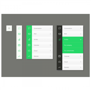
You may need to swap and change your navigation a bit, but it will be worth it. A simple drop-down selection so users can easily visit the page they want will ensure they don’t get bored or frustrated of finding the relevant information they came to your website for. 
Tip 6
Most importantly, user’s experience must be at the forefront when you’re developing your website every step of the way. Their experience will ultimately decide if they visit your site again, use your services or buy a product.
Test your responsive website, test it again and again until it is perfect. I don’t mean just using your phone to test the responsiveness, try iPads, Tablets, Android, iPhone, Windows and other devices. Start from the beginning, consider different users, test the buttons, check the readability and source feedback from other colleagues.
About the author:
Marie Harwood is a Digital Marketing Assistant at Different Gravy Digital, Hale, Cheshire.
Different Gravy Digital are a full service Digital Marketing Agency operating in the Hospitality & Leisure, Financial Services, Legal & Property sectors. Products and services range from; 3D & 360° Tours, Website Design & Build, Social Media, Video Production, Search Engine Optimisation (SEO), Content Creation, Email Marketing, Online Feedback / Review Systems and Paid Advertising (Google, Bing and Social Media).
Contact Details:
marie@differentgravydigital.co.uk
0161 706 0004
120a Ashley Road, Hale, Altrincham, Cheshire, WA14 2UN