Your Beginners Guide to a Perfect Landing Page
Your product may be irresistible.
Your PPC ad may be perfectly optimized. Or, your email campaign’s design may be faultless.
But without a good landing page, your efforts are completely wasted. And consequently, your business and ROI will suffer.
Your landing page can often determine the success or failure of your online marketing. We’ll start from the beginning, you need to know what one is and why they’re important before you can understand how to make them work.
For those who need reminding, your landing page is a single webpage with the specific purpose of increasing your conversions.
There’s a lot of confusion with the definition of a landing page, which is often perceived as the page users ‘land on’ when they click your advertisement. Whilst this isn’t technically untrue, there’s a bit more to them than that …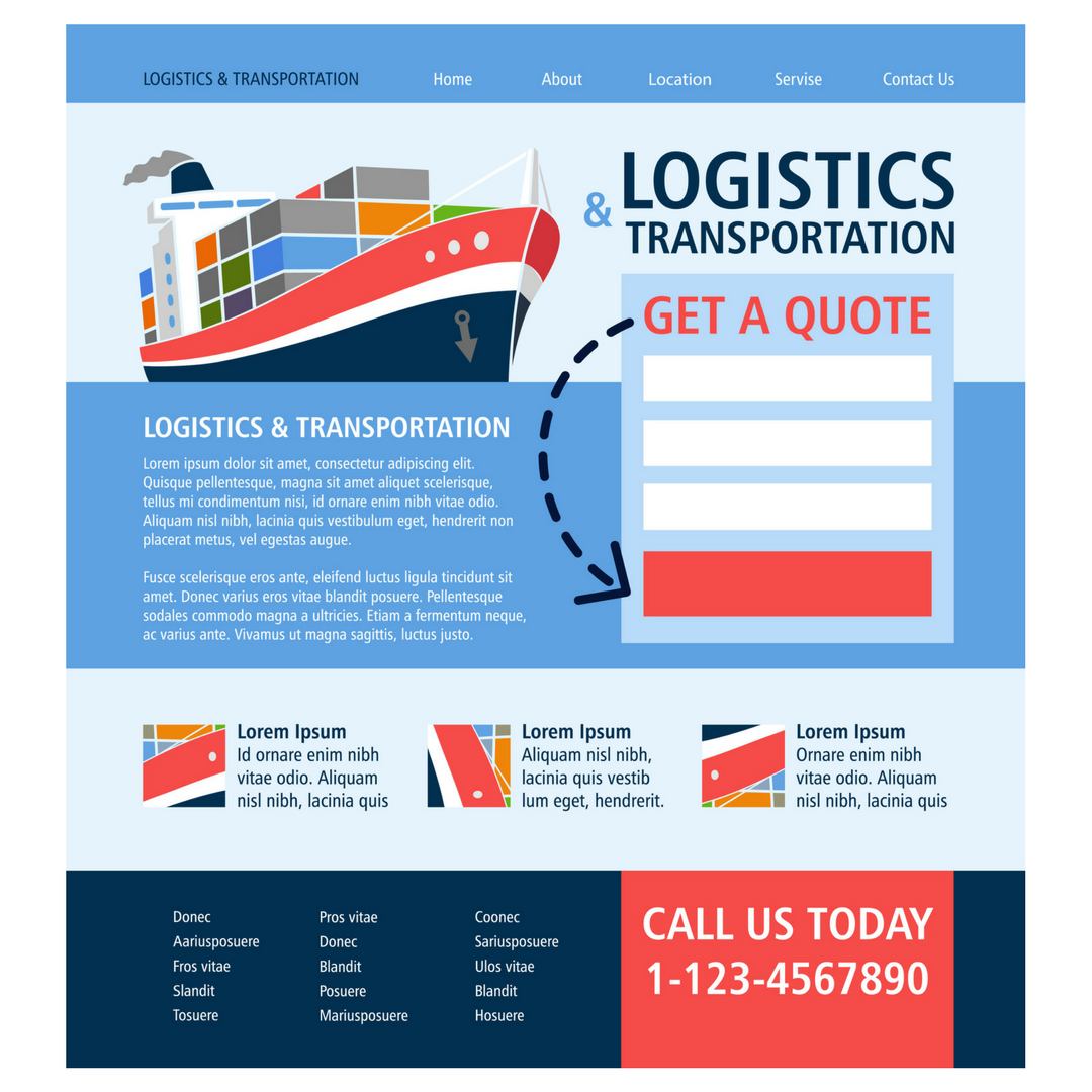
1. A landing page includes a form
2. The form captures visitor’s information
This is where I think there can be a bit of confusion. Through the form on your landing page, where you’ve captured valuable data, you’re supposed to increase the chances of converting traffic on to your landing page in to leads.
Whilst that’s technically the definition of a landing page, I think it’s just easier to think of a landing page as a page where you want your visitors to do something. Whether that ‘form’ be subscribing, buying, enquiring or completing a survey, it doesn’t really matter.
Your Landing Page shouldn’t be your home page.
I just wanted to make that clear. If your landing page is your home page, it’s a complete missed opportunity.
You’ve got a stream of specific traffic coming to your website … the page they land on needs to be targeted specifically to your intended audience. Your generic home page is a lot less likely to convert traffic into leads than a targeted landing page.
Say your landing page is your home page, what do you want them to do? It’s unlikely it’ll be crystal clear on your homepage, hence the need for a new page tailored towards your audience.
Now you know what not to do, here’s what you need to do.
Give a Clear Call-to-action
What do you want your audience to do! Don’t assume they’ll know what you want from them, just tell them plain and simple.
Download? Subscribe? Buy Now?
Keep it Simple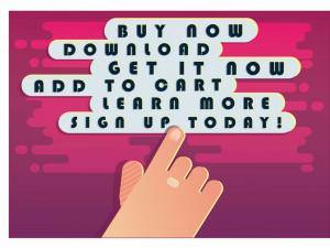

Remember the purpose of your landing page – converting traffic in to leads. Don’t distract users from doing exactly what you want them to.
Your page design will affect how many conversions your landing page drives. Whether it be filling out a form, signing up for a newsletter, buying a product or enquiring about a service, it’s important there aren’t any distractions from your main objective.
For example, don’t have any pop-up ads. The last thing you want is for visitors to click on to another site or forget about why they clicked your link in the first place.
Make Your Ad Relevant to Your Landing Page.
We’ve all been there, clicked on a link from an ad and then soon discovered it was a complete time-waster. There’s no point in deceiving your audience. It will only get you as far as increased traffic to your website, which isn’t where the money is. If you want to make conversions, tell your audience exactly why they should click on your link and then deliver the content they’re expecting.
Keep it Snappy
It’s right to assume if visitors on your landing page are genuinely interested in what you have to offer – since they’re clicked on your link. But once they arrive, you can’t assume they’ll wade through a tonne of information if you’re not getting to the point.
If you want them to subscribe to your newsletter, just let them do it! I’d suggest not making your visitors scroll right to the bottom of your page to do so.
Don’t include information on your page for the sake of it. Every word should have a purpose. Every word should encourage your audience to your call-to-action.
Speaking from experience, if I click on an ad to a landing page without clear instruction right away, I just get bored and exit.
Keep the Focus on Your Landing Page
I think this point comes more down to personal preference, but if I where you I’d remove navigation elements from your landing page. As I said before, the primary focus is your call to action, so that should be the only clickable link. If you insist on having a link back to your ‘proper’ home page, maybe have the link in your logo to avoid side-tracks?
The Bottom Line
Everything I’ve said can be summed-up in to just 6 words.
Tell your audience what to do.
Keep it simple, remember, you’re focus is pushing conversions.
P.S – test, test and test again! Experiment with different colours, button styles, different layouts and so on. You will find some of your landing pages work better than others – but your analytics will help to see what works best for you and your business.
About the author:
Marie Harwood is a Digital Marketing Assistant at Different Gravy Digital, Hale, Cheshire.
Different Gravy Digital are a full service Digital Marketing Agency operating in the Hospitality & Leisure, Financial Services, Legal & Property sectors. Products and services range from; 3D & 360° Tours, Website Design & Build, Social Media, Video Production, Search Engine Optimisation (SEO), Content Creation, Email Marketing, Online Feedback / Review Systems and Paid Advertising (Google, Bing and Social Media).
Contact Details:
marie@differentgravydigital.co.uk
0161 706 0004
120a Ashley Road, Hale, Altrincham, Cheshire, WA14 2UN